A day or two ago I wrote about the ‘perfect’ tasting (as if there is such a thing), and mentioned the importance of having the correct wine glass, or at least a glass that is suitable for tasting. Certainly in recent years there has been a lot of research in the field of wine glass design, so much so that it has become a science in itself, and manufacturers now sell distinctly different designs for almost every conceivable type of wine. It wasn’t that many years ago when more or less the only recommended glass for professionals was the official ISO tasting glass, but this was soon dismissed as being too small and clumsy to do the job effectively. It was soon overtaken by designs made by some top glass producers such as Spiegelau, Schott, Zwiesel, Bormioli, Cristal d’Arques, Dartington and probably the most famous of all, Riedel.
A wine glass is divided into three parts – the bowl, the stem and the foot, and of course the most influential of these as far as taste is concerned, is the bowl. These days the tulip shape is largely preferred to the balloon shape (the latter made famous by the old Paris goblet). The design of the stem and foot are made with more practical issues in mind – that the stem doesn’t break too easily, or that the glass doesn’t topple over too easily when filled. Together however, all three elements should combine to produce a well balanced glass with a nice ‘feel’, not too heavy, and certainly not patterned or coloured.
The bowl should be curved and smooth on the inside to not inhibit swirling, and should preferably taper inward slightly towards the rim keeping the wine’s bouquet focused towards the nose and preventing too much from escaping. A proper wine glass should be large enough to contain a full serving when only half full (not overfilling a glass is actually sensible, not mean). This provides adequate space for both swirling without spilling and provides the “chimney effect” that concentrates and directs aroma towards the nose. The width and depth of the bowl will differ according to the type of wine it is intended for as it physically determines the distance between your nose and the surface of the liquid. This will alter the way that you perceive the different elements of the wine, such as fruit, spice or perhaps the level of alcohol.
Finally the rim of the bowl will divert your wine towards the different receptors on your tongue – a narrow rim directs wine to the middle of your tongue first, and because acidity receptors are located at the sides, your first taste sensation will be fruit. In the case of a wide rim, wine is diverted directly to the edges of the tongue and acidity is detected first, making wine taste more rounded as the acidity blends with the fruit.
Whichever shape you choose, there is no doubt that fine, crystal glass feels best, even if it might be a bit more prone to breakage. In a similar way, being English, I also believe that my tea tastes better from a fine bone china cup too!
(See video of my old friend Joe Wadsack presenting white wine glasses on our YouTube page)


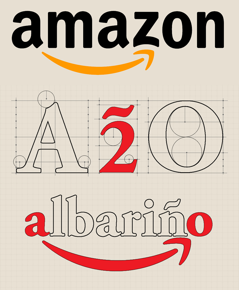 Well, you learn something new every day as they say, but only recently did I discover that Castro Martin actually has something in common with one of the largest companies on the planet!