Replacing a classic
August 6th, 2014 | History
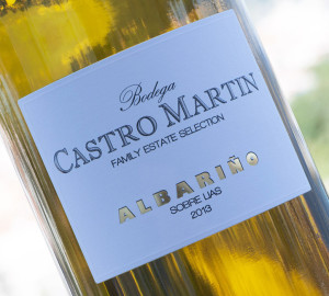
 The Bodega Castro Martin label that we have been using until now, was the original design that we created for the very first vintage of this brand back in 2002. It is quite unusual for any label to survive for so long without even the slightest modification, but we unwittingly created such a ‘timeless’ design that even now it does not looked in the least bit dated. This doesn’t mean however, that the time for change doesn’t eventually arrive, and so last year we set about working on an upate – very much with the 2013 vintage in mind.
The design brief was to try to come up with another classic design that would also stand the test of time. Of course, being our premium brand we also wanted the label to exhibit an aura of quality, and so it was never going to be an easy exercise.
Our new 2013 Bodega Castro Martin (Family Estate Selection) is only now starting to appear on the market as customers take their first shipments of the new vintage, and so we anxiously await the initial reaction. Please take a moment to examine this new label closely and notice the attention to detail – the raised screen printing, the gold foil with shadow outline, and the embossed border. It certainly looks minimalist, but I can tell you that a great deal of thought went into the final design. We really hope that you like it!


