Archive for ‘Labels’

Medals on labels?

January 28th, 2022 | Competitions

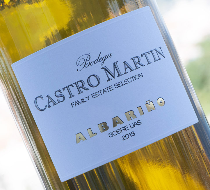
I recently made a post about our Castro Martin Family Estate albariño winning a Gold+ Medal in the Distinciones Gallaecia (Guía Luis Paadín de Vinos 2022). Quite naturally, I wrote to my customers around the world to advise them, as obviously this can sometimes help to give a little boost to our sales.

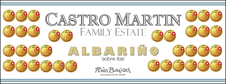
In some countries there used to be, and still is, a fashion to have medals printed onto the labels of award-winning wines. In Australia for example, the culture of wine shows and competitions is very strong, they are held annually in many towns and cities across many States. As a result, a huge number of wines end up with gold medals, and (dependant upon the stature of the show), these can be held in very high esteem. As such, it is quite common to see some wine labels emblazoned with rows of gold medals. (A bit OTT for my personal taste). The problem is that it sometimes can feel like there are simply too many medals on offer, and in the end there is a danger that such accolades become over-used, thereby diluting their credibility.

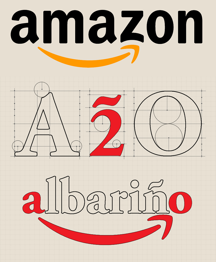
So, when I wrote to my importer in Australia telling him about this award, he immediately replied by saying “please, don’t print your medal on the label!” To be honest, I actually had no intention, but I did reply by sending him a draft of what I was proposing (see today’s picture) just to test his reaction. I can’t publish his reply…. but it was very funny!

What’s in a name?

February 27th, 2019 | Bodega

The oldest brand that we have in our portfolio (which is almost exclusively sold within Spain), is Casal Caeiro. We decided not to use it too much in export as some people struggle a little with the pronunciation of Caeiro. (It should be Kye-yeh-roh, more or less). This name dates back to the time when the current bodega was built in 1981, on a site in the municipality of Ribadumia called O’Caeiro. Coincidentally, there’s another place only a few kilometres from the Bodega called O’Casal, but that is not the origin of the name in this instance. Casal also means large house, so in effect, the wine is named after a large house on the site of Caeiro.

This rather old looking, new map shows all the old, local names.

We are family!

May 1st, 2018 | Bottles and bottling

For quite a few years now we have noticed that more and more Rias Baixas wine cellars are being taken over by large groups, many from other wine regions of Spain (Rioja producers for example). Clearly it is easier for them to offer a range of wines from around the country, rather than just one local wine, made from a single grape variety – as in the case of our very own albariño. The obvious consequence of this is that there are now fewer and fewer family-owned businesses, and even less that are managed on a day-to-day basis by the actual owners.

It’s no co-incidence that when we created our Castro Martin label some 15 years ago, we decided to call it “Family Estate Selection” (and not simply because the wine is made from the fruit of our family-owned vineyards). The original label placed great emphasis on the grape variety, and then the fact that the wine is made ‘Sobre Lias’ (with extended ageing on the lees), but now we have decided to modify this just a little.

We have recently printed a new label that includes a subtle change – on the front we have replaced the words ‘Sobre Lias’ with the words ‘Family Estate’, the idea being to place more emphasis on being a real family business. Sobre lias is of course, still mentioned, and we have also added the sub zone of our bodega (we are located in the Val de Salnés). It’s simply that in this ever changing world, we believe that being a family producer is still very meaningful!

Red Stripe Albariño?

February 20th, 2018 | Bottles and bottling

[:en]Now there was you thinking that Red Stripe is a brand of beer founded in 1928 and originating from Jamaica. Well, it still is, but now perhaps there is a new version…. Red Stripe Albariño?

Actually not. This is simply a ‘gift’ from our printer. As you may already know, our new Casal Caeiro label is actually a quadriptych – a four part label, that joins together to form one large picture. However, when it is joined together this is not usually done using a thick red adhesive tape – this is just an anomaly of the printing process. Now I am just guessing here, but I think that when the labels are being printed, and our printer needs to change the paper roll, then they will simply stick the two rolls together using this tape. It certainly makes quite a startling contrast when these bright red stripes suddenly appear during a bottling run. (At least they are not difficult to miss!)

I should say that the four bottles in the photo did not come from one single batch, but have been collected over the several months that we have been using this new label. Maybe we should leave them in the cases and offer a prize to the people that discover them![:es]Now there was you thinking that Red Stripe is a brand of beer founded in 1928 and originating from Jamaica. Well, it still is, but now perhaps there is a new version…. Red Stripe Albariño?

Actually not. This is simply a ‘gift’ from our printer. As you may already know, our new Casal Caeiro label is actually a quadriptych – a four part label, that joins together to form one large picture. However, when it is joined together this is not usually done using a thick red adhesive tape – this is just an anomaly of the printing process. Now I am just guessing here, but I think that when the labels are being printed, and our printer needs to change the paper roll, then they will simply stick the two rolls together using this tape. It certainly makes quite a startling contrast when these bright red stripes suddenly appear during a bottling run. (At least they are not difficult to miss!)

I should say that the four bottles in the photo did not come from one single batch, but have been collected over the several months that we have been using this new label. Maybe we should leave them in the cases and offer a prize to the people that discover them![:]

Now it’s official!

June 12th, 2017 | Bodega

For the last couple of months I have been hinting in my posts about something new coming to Castro Martin – and finally it’s here – a new label!

A label? Is that all? So why all the fuss? I hear you ask. Well, the answer is quite simple –  the fuss is because this is something of an historic change.

The very first, and original brand of the new era (since the current bodega was built in 1981), is Casal Caeiro, created by Angela’s father some 35 years ago. (The Martin Family had been making albariño long before this, but mainly for local consumption, without labels, before labels were a legal requirement). Since it’s inception the Casal Caeiro label has slowly evolved and appeared in many different guises, but until now they have always had one thing in common – the Pazo vineyard had always appeared on the label.

In a break with tradition we decided to employ the services of local artist Elena Gomez Dahlgren to come up with something different (and original), and I think that her new design idea is both unique and spectacular. A quadriptych – a set of four labels that when displayed side-by-side join to form one larger picture.

The new 2016 vintage, using this presentation, is available from this week (albeit that our website will take a little time to catch up). New photos already appear on our webpages, and updated fiche and bottle shots are also available. In addition to this, we will eventually add more information about the inspiration behind the design, and also about our artist, but in the meantime you will simply need to buy some wine to see this work of art first hand. Oh, and by the way, you will need to buy at least four bottles to see the complete design!

Maybe not so stupid after all!

May 11th, 2017 | Business

A to ZWell, you learn something new every day as they say, but only recently did I discover that Castro Martin actually has something in common with one of the largest companies on the planet!

One of our most Frequently Asked Questions is about the logo/name of one of our brands – A2O, and to be honest I feel just a little embarrassed when I have to explain it’s origin…. but not any more. It seems that the logic behind it (if you can call it logic) is shared with one of my most frequently used websites, Amazon. Please allow me to explain.

The name A2O quite simply comes from the word AlbariñO, which starts with the letter A and ends with the letter O, in other words from A to O (and we have simply substituted the word ‘to’ with the number two, and given it an accent to add a bit of a Spanish flavour). So that’s the story – clear as mud, I’m sure you’ll agree!

OK, so what about Amazon you ask, and where’s the similarity? Well, did you ever notice the arrow in their logo that underscores the name? Do you know why it’s there? I didn’t. If you look at the placement of the arrow it actually points from the A to the Z, and yes, you may have guessed already – the implication is quite simply that AmaZon stocks everything from A to Z (or should that be A2Z?!)

I have to admit that knowing this makes me feel a whole lot better, and it goes without saying that the next time someone asks about A2O, I will also make a point of explaining our very tenuous link with Amazon.

The final clue!

May 8th, 2017 | Bodega

Final clueOver the last two or three months I have dropped a few clues about something new happening in the bodega. The launch of whatever this might be is imminent, and so I thought I would add one final clue before we make it official.

As you may know, I am quite a keen amateur photographer, and many of the photographs that you see both on our website and on our social media pages are taken by me. It is however, rare to see me at work, but in today’s picture (working on our new project), I have been captured in the act, so to speak. On a few previous occasions when I have been taking photos I have caught myself in a mirror or perhaps in some type of reflection, but it is really odd to actually see how others perceive me when I am working…. the photographer’s photograph, if that makes any sense?

Anyway, in a couple of weeks we will be making an official announcement about our closely guarded secret, so watch this space, as they say.

Replacing a classic

August 6th, 2014 | History

BCM 2013The Bodega Castro Martin label that we have been using until now, was the original design that we created for the very first vintage of this brand back in 2002. It is quite unusual for any label to survive for so long without even the slightest modification, but we unwittingly created such a ‘timeless’ design that even now it does not looked in the least bit dated. This doesn’t mean however, that the time for change doesn’t eventually arrive, and so last year we set about working on an upate – very much with the 2013 vintage in mind.

The design brief was to try to come up with another classic design that would also stand the test of time. Of course, being our premium brand we also wanted the label to exhibit an aura of quality, and so it was never going to be an easy exercise.

Our new 2013 Bodega Castro Martin (Family Estate Selection) is only now starting to appear on the market as customers take their first shipments of the new vintage, and so we anxiously await the initial reaction. Please take a moment to examine this new label closely and notice the attention to detail – the raised screen printing, the gold foil with shadow outline, and the embossed border. It certainly looks minimalist, but I can tell you that a great deal of thought went into the final design. We really hope that you like it!

Easter label?

April 20th, 2014 | Fiestas

weingut knollAs Christians around the world celebrate Easter Sunday I did think about adding a picture of some decorated eggs to brighten up today’s post. Apparently the giving of eggs at Easter is supposed to symbolise the giving of new life – the resurrection if you will…. It could be said however, that this underlying meaning has since become a little lost, and that for many children at least, it has become more to do with the worship of chocolate. The symbolism of the Easter Bunny (or hare) is perhaps even more tenuous – it allegedly relates to the legend of an Anglo-Saxon goddess and a magically transformed hare that discovered it could lay eggs! Enough said.

So, instead of all this, I decided to include a wine label from Austria. Weingut Knoll is located in the well-known wine region of Wachau and produces mainly white wines, predominantly Grüner Veltliner and Riesling. The wines are vinified more especially for long keeping and the winery is also highly acclaimed for its selection of sweet dessert wines (where vintages permit). Knoll wines are instantly recognisable by their very traditional labels, which it must be said, would not look out of place in the Vatican.

Self-adhesive gorillas…

August 15th, 2013 | Labels

HTC SmartphoneWhat happens when you’re smart phone becomes too smart…. or at least when it thinks it is? The other day Angela went to an official tasting at the Rias Baixas denomination office in Pontevedra. Whilst she was there she had to collect a box of ‘tirillas’ (in case you don’t remember these are the small stickers that we attach to every bottle to prove that our wine has passed the official tasting and is an authentic Rias Baixas wine). It is the proof of origin if you like.

On my new, all-singing, all-dancing HTC smart phone I wanted to send Angela a simple message to remind her to collect these special labels. What I typed into my phone was “Don’t forget to collect the tirillas”, but what my smartphone thought I wanted to type was “Don’t forget to collect the gorillas”! Suffice to say that Angela was just a little confused!

This morning when we actually came to bottle the wine in question, we started with a problem that we sometimes have at this time of year – sweating bottles. When the cold wine hits the slightly warmer empty glass bottle, a very fine film of condensation forms which can prevent the labels from sticking properly. On this occasion it was the tirilla that refused to stick properly, which made me laugh….. I couldn’t resist telling Angela that the ‘gorillas’ wouldn’t stick to the bottle! I apologise yet again for my infantile sense of humour, but I’m told that it’s only healthy to laugh now and again (even if it is at your own jokes!)

HTC SmartphoneWhat happens when you’re smart phone becomes too smart…. or at least when it thinks it is? The other day Angela went to an official tasting at the Rias Baixas denomination office in Pontevedra. Whilst she was there she had to collect a box of ‘tirillas’ (in case you don’t remember these are the small stickers that we attach to every bottle to prove that our wine has passed the official tasting and is an authentic Rias Baixas wine). It is the proof of origin if you like.

On my new, all-singing, all-dancing HTC smart phone I wanted to send Angela a simple message to remind her to collect these special labels. What I typed into my phone was “Don’t forget to collect the tirillas”, but what my smartphone thought I wanted to type was “Don’t forget to collect the gorillas”! Suffice to say that Angela was just a little confused!

This morning when we actually came to bottle the wine in question, we started with a problem that we sometimes have at this time of year – sweating bottles. When the cold wine hits the slightly warmer empty glass bottle, a very fine film of condensation forms which can prevent the labels from sticking properly. On this occasion it was the tirilla that refused to stick properly, which made me laugh….. I couldn’t resist telling Angela that the ‘gorillas’ wouldn’t stick to the bottle! I apologise yet again for my infantile sense of humour, but I’m told that it’s only healthy to laugh now and again (even if it is at your own jokes!)

Monthly Archives

Categories

ARE YOU OF LEGAL AGE? This site is intended for those of legal drinking age. By entering, you confirm that you are of legal drinking age in the country where this site is being accessed. ¿ERES MAYOR DE EDAD? Este sitio está destinado a personas en edad legal para beber alcohol. Al ingresar, confirma que tiene la edad legal para beber en el país donde se accede a este sitio.